Senior Capstone Project: Democratizing Air Quality

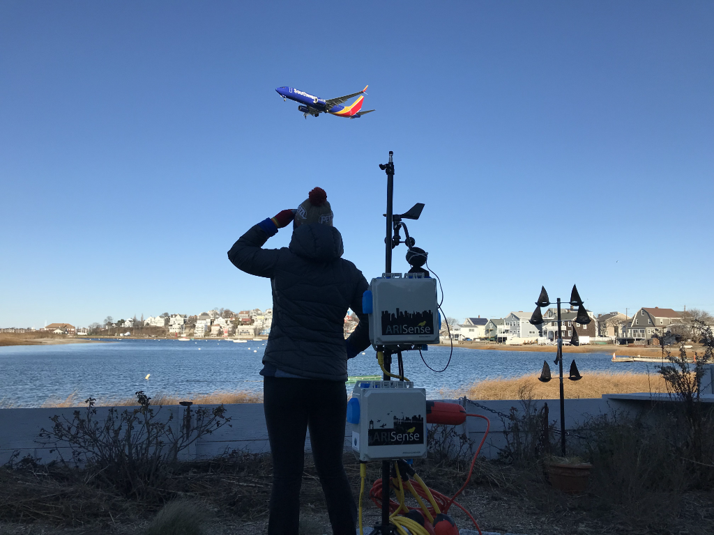
An airplane flies low above a neighborhood, emitting plumes of ultra-fine particles which negatively impact health.


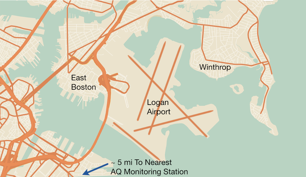
For our senior capstone project, we partnered with Aerodyne Research Inc and AIRInc to build a pilot network of low-cost air quality (AQ) sensors in East Boston. Our team focused on the software infrastructure for collecting, storing, analyzing, and serving the data to both the public and scientists. QuantAQ, our liaison’s startup, is continuing the technical development of the project.
My role: Developed UX spec; Wrote embedded code to connect sensors and instruments to cloud; Designed public communication materials; Managed budget.

Collaborators

We worked with some incredible people on this project, from scientists to community advocates!

Project

Residents can smell the jetfuel and know that something is wrong. But they don't know why or how bad it is or what to do about it.

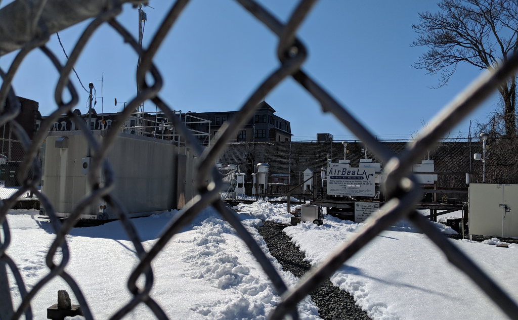
Reference-grade AQ monitoring stations are large (~1/4 football field), expensive to maintain, and their data is hard to access.

Current AQ monitoring stations are too sparse to provide the hyper-local data citizens need to make real-time health decisions.

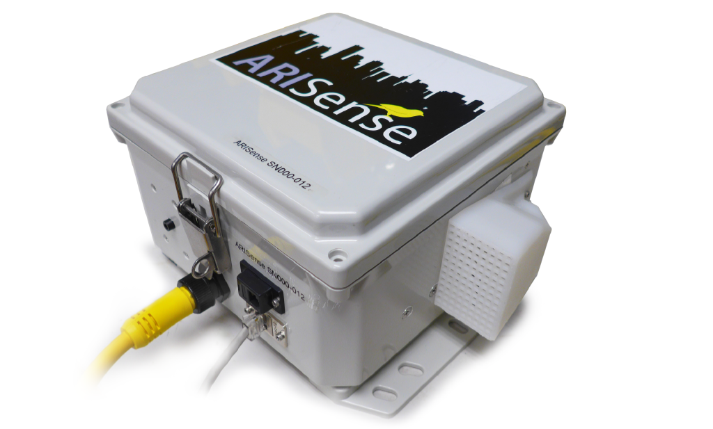
ARISense is a small, low-cost AQ sensor built at Aerodyne. It can measure and publish data to the cloud on the order of seconds.

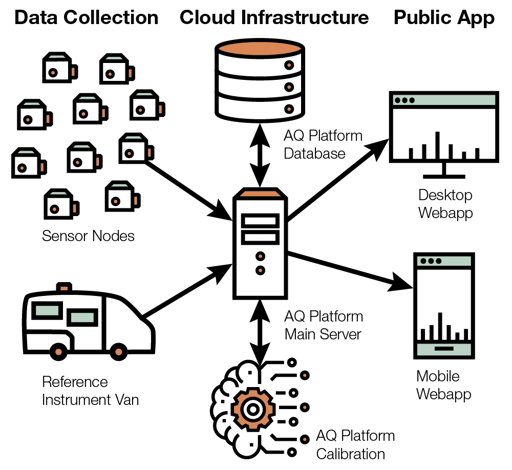
Data from the sensors is sent to the cloud to be calibrated, stored, and made accessible to both citizens and scientists.

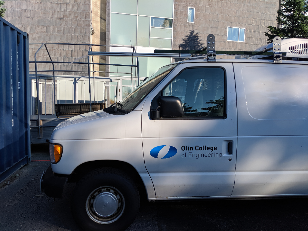
Sensors are calibrated by a combination of online machine-learning models and on-site comparison to reference instruments in our mobile AQ lab van.

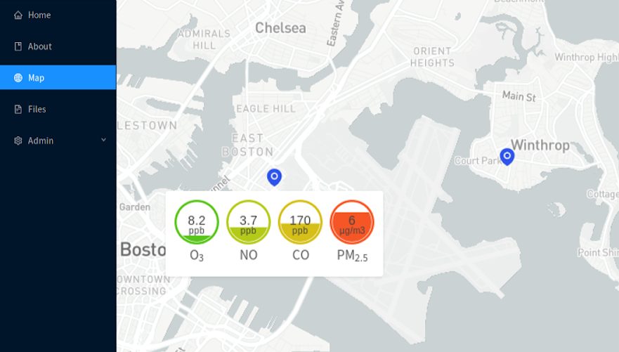
The public can view AQ data in real-time, gain an intuition for what is good or bad AQ, and feel empowered to advocate for themselves.

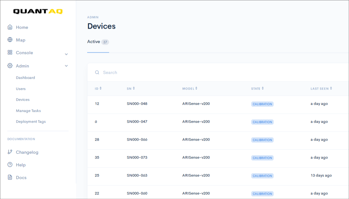
Researchers can deploy networks of their own, going from working with a single instrument full-time to easily managing hundreds or more.

Process

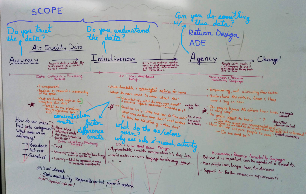
We started our project by identifying our stakeholders and design goals.

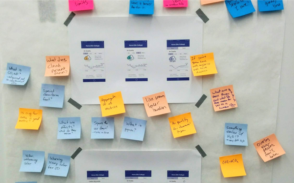
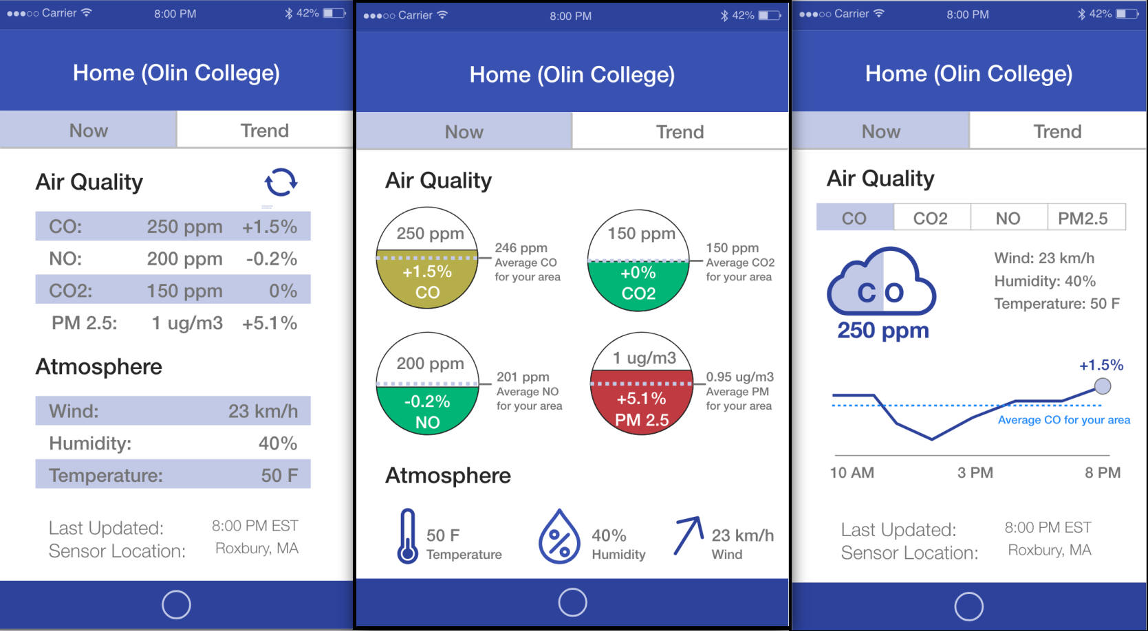
We conducted user research to understand how to make air quality data accessible, accurate, and actionable to our stakeholders.

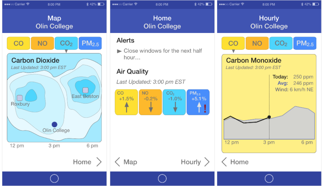
Initial designs targeted questions like how do you users respond to colors? How do they interpret numbers? How do we show change?

Check out this interactive prototype I made in Adobe XD! Click around as you would in an app.

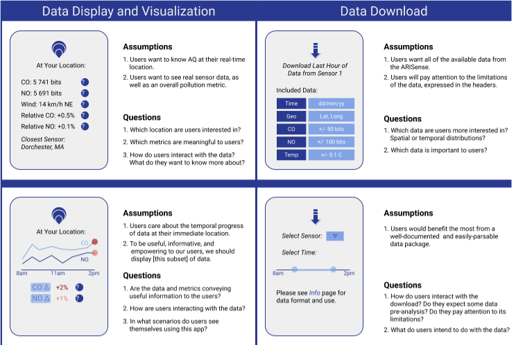
We created a plan for testing and developing the UX, identifying assumptions to be tested in each phase.

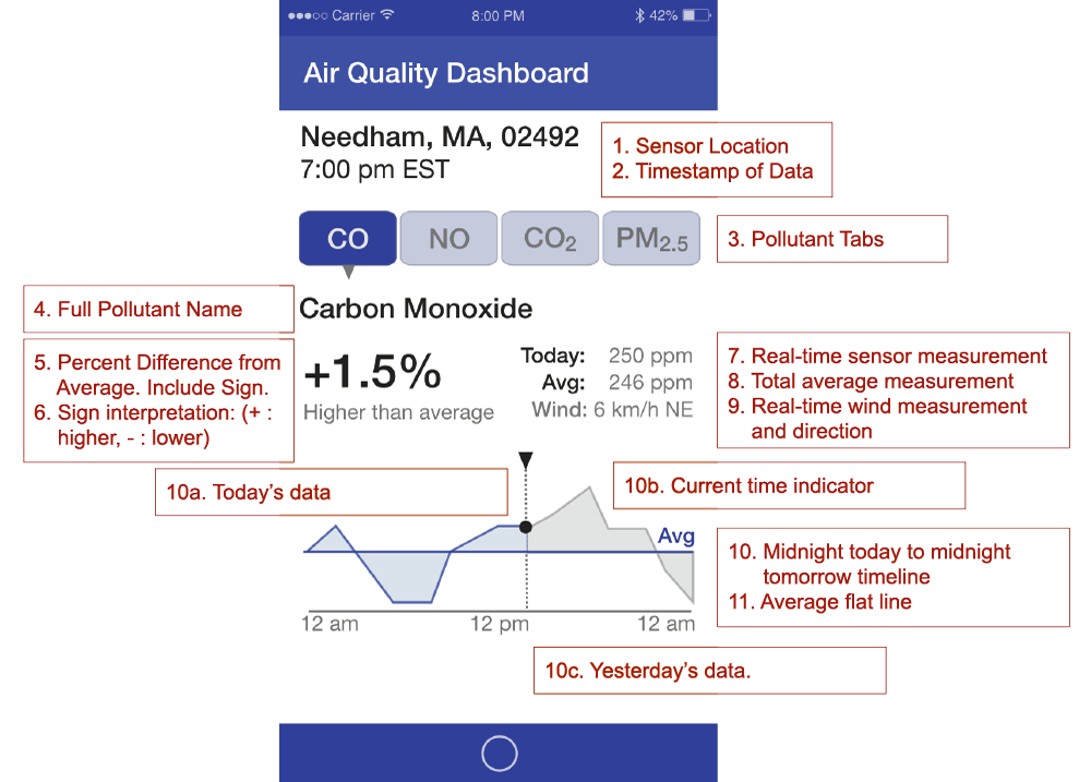
The end result was a UX specification which our frontend developer worked from.